
I am suggesting for the text not to be next to it.
Like subtitles in a movie.
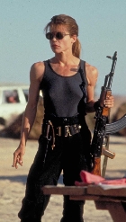
 vs
vs 
But with better looking subtitles.
Why still stick layout that was due to html limits when there is so much more possible? For example the overlay in the android version?
I'm using the full screen option. But seeing as in the android version the text is already on top of the image, not under or above it. Why not have it still on top but give an option to choose landscape vs portrait. Since most teases are using pictures that only cover half a pc screen. Images are already more portrait than landscape. Is it a technical limit why it can't be done? If not, why not try to make it look right instead of not doing it at all. Just because it is what it is, does that mean it can't be better anymore?philo wrote:The android version has the option to go full screen (select preferences and full screen mode)0385 wrote: And the android version, Quite a few images are portraits when the app is forcing landscape. There too is half the screen wasted on black instead of women.
I have given some thought to implementing a portrait mode for android, but it didn't really look right, it would be possible to detect portrait pictures and rotate them 90 degrees but then you would need to turn the screen to look at it, which is a bit clumsy.
I am open to suggestions for the android version